Accessibility
Accessibility shouldn’t limit the design, but instead does everything right to optimize the ADA support we provide.
We know ADA requirements can be difficult and often limiting for designers. We’ve heard designers say that they feel the limitations of font sizes, color combinations that are not acceptable, and a host of other aspects of providing solid ADA support.
We wanted to get to the point where we can do so much better than the minimal requirements of ADA, so that we could be proud of giving designers their freedom, while providing a level of support that was well beyond those set as an acceptable minimum.
With QuickSilver® there really isn’t a need for that anymore. Since we can tailor media delivery to your different audiences, it’s easy to provide a high contrast version that is specifically designed for optimal readability for someone who has reduced vision.
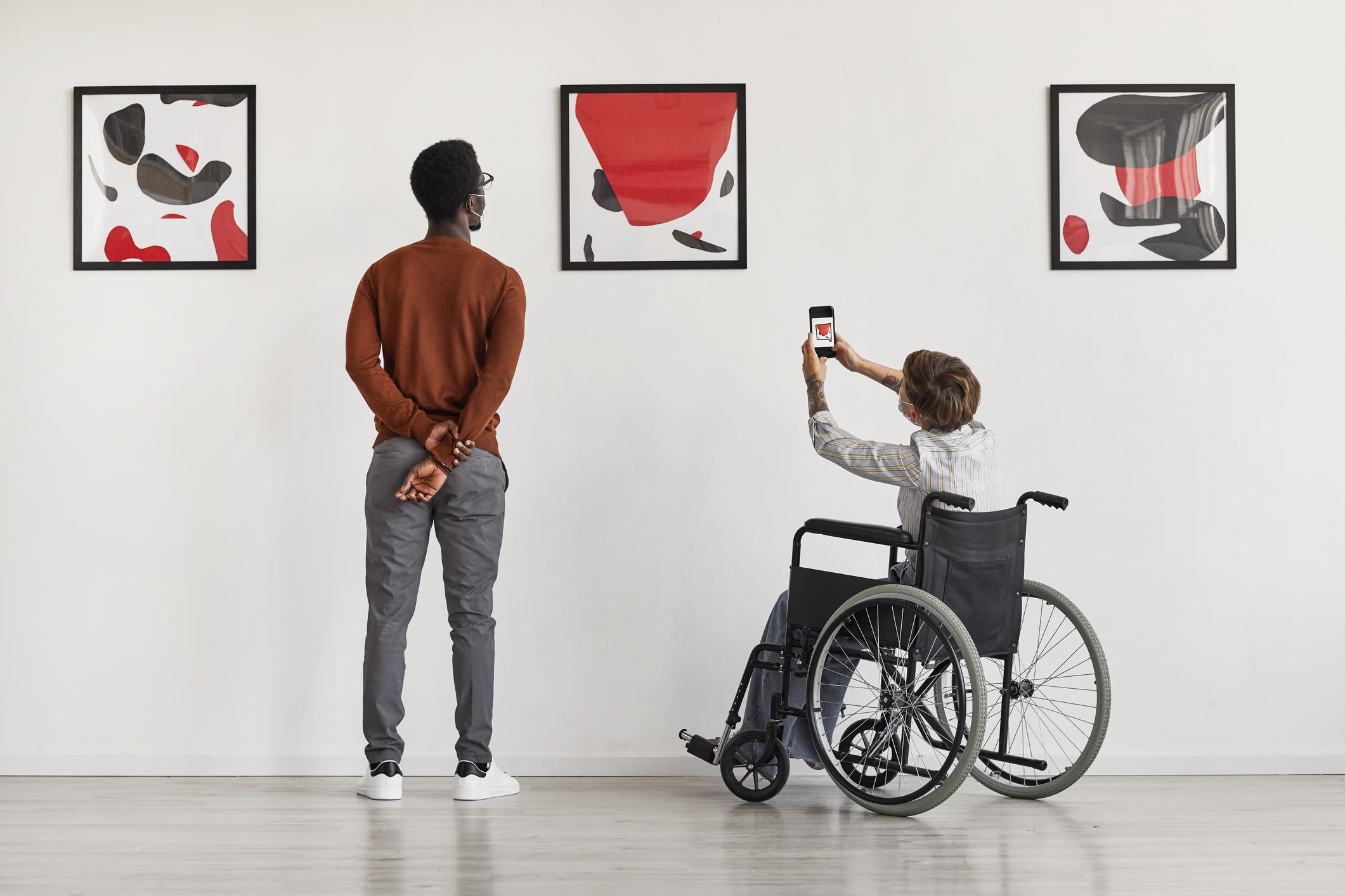
With our personalized media delivery option we can drop the buttons on an interactive screen to make sure they’re easily accessible to someone in a wheelchair – naturally and easily. No fuss.
Mad Systems have gone well beyond taking these limitations away. We’ve also come up with Caterpillar, an innovative method for guiding visually impaired visitors through a space. We’ve created Dormouse that will help hearing impaired people by providing their own audio through inductive loops or bone conduction methods.
Our technology is more advanced than anything out there – and when it comes to a better deal for people who need a little extra help, we’ve tried to do our best there too – and we’re proud of the results.
